

Feb - April 2018
SPRIG
Brand Identity — New York (remote)
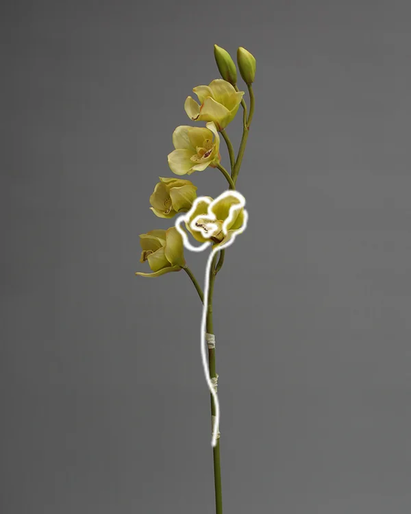
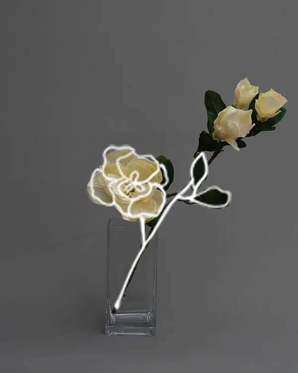
SPRIG is a faux floral atelier founded to bring the simple joy of flowers to the everyday, for everyone, one bespoke silk flower at a time. Thoughtfully made and handcrafted, every one of their everlasting faux blooms and botanicals represents their obsessive attention to quality and good design.

SPRIG arrangements draw inspiration from the natural world, creating stunningly textured, organic, and unexpected styles. Each bespoke silk bloom is hand crafted and painted for a truly natural look and lifelike feel.


I wanted to create a look that is everlasting and fluid - just like the faux blooms and botanicals of SPRIG. A rounded type font, to mimic the fullness of the blooms, with watercolor and clean lines to lend idea to the non-restrictive capabilities of working with faux florals.

To counter the bright, dramatic colors of the blooms and botanicals, SPRIG’s color palette consists of dark, cool tones and warm neutral hues, allowing some room to include a few “poppier” options for seasonal products and collaborations.

Exploring various ideas for a unique packaging, I was keen on the idea of incorporating origami style folding techniques into the unboxing experience of the box.

A packaging prototype inspired by ‘origami style’ folding techniques.


